Annie Atkins: A creative practitioner that inspires me.
- okrawczyk
- Jul 1, 2021
- 3 min read
Annie Atkins: Designing Graphic Props for filmmaking
We often think of graphic design being about branding, logo design, illustration etc. However, every time you watch a film or TV series, many of the props have been designed specifically for that film and that has been carried out by a graphic artist.
Annie Atkins is a Dublin based graphic designer for film making. She designs props background signage for actors to work with one set. Things such as postage stamps, bank notes, ration books, letters, maps, newspapers and more are all designed by Atkins. She started off her career working in advertising but later left to go and study film. Atkins found herself working in production design and found it was a great way to combine her love of films and graphic design. Her first role after she fished education was for the TV show ‘The Tudors’. Atkins designed all sorts of props for this series with everything from royal scrolls to death warrants for Henry VII.


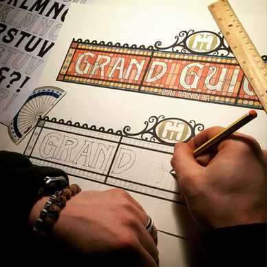
Annie Atkins has worked on many well known films and series, but my favourite work of hers comes form The Grand Budapest Hotel. Wes Anderson is by far one of my favourite film directors and this film is my favourite of his. When I first watched it I was fascinated by the colours used throughout and in particular the ‘mendls’ box that appeared throughout the film. When I was reading a review of the film at a later date, I found out that Annie Atkins was the one who designed this particular prop, and I started to look into her work more. Before coming across Atkins, I dint even know about graphic design for filmmaking, it makes sense now I know about it, but it’s not something you think of when you watch a film.


This prop appeared in almost every scene in The Grand Budapest Hotel, and I felt in added so much depth to the scenes. The pink and blue work together so well, and the soft red of the text gives it such an elegant look. When I see this box or a colour similar, I instantly think of this film. I love typography and the type in this film is just beautiful! When reading though Atkins’ book I discovered she also designed the hotel signage for the film, in a typical style for the 1930s. Atkins specifically made the sign have poor kerning to make it look authentic and as though “at some point in the buildings lifetime, a letter had come loose from the roof and a hotel caretake had climbed up a ladder to stick it back up again’. When designing props Atkins has to make them look authentic to the era and usage. That might mean making letters look crinkled or making sure the handwriting in letters fitted that of the time period.


What fascinates me about this area of design is that not much of the work is noticeable to the audience. As Atkins said in an interview “Maybe 90% of what we make for a film belongs firmly in the background”. After buying her book I was amazed to see how much detail goes into work that isn’t really seen yet makes such a big impact to the asset and overall film. Although this isn’t an area of design I will likely go into to, it’s an area that I have a much greater appreciation for and I pay much more detail to the films I watch now, and think about the graphic design hidden within.


Comments